
SJ Doodles
Tuesday, December 21, 2010
Thursday, December 16, 2010
Jesus Christ!
Friday, December 10, 2010
Thursday, December 9, 2010
Wednesday, December 8, 2010
Tuesday, December 7, 2010
Friday, October 15, 2010
ZOMBIE ninja TURTLE!
Zombie Turtles
Tuesday, October 12, 2010
LET'S BE CREATIVE AGAIN! YAAAAAY!!!!!
So....Sketchoholic.com has contests all the time that anybody can participate in. They're great ways to get the juice flowing and most of them offer some sort of prize. This week there's a contest with the topic "Zombie Turtle". So I thought it'd be a good way for us to jump start this blog again. The contest ends on Sketchoholic on Friday at 10:55 pm. Then you can vote for your favorites. **There's not too much competition on most of those contests, but it really helps to be creative.** Click HERE to check out the rules and regulations along with some of the entries that people have already posted (like I said, not too much competition). You WILL have to register with Sketchoholic to post anything or vote if you haven't already. IT'S FREE!!! so don't be a bum.
Wednesday, April 28, 2010
Thursday, February 25, 2010
cheshire cat
Thursday, February 18, 2010
Redemption, I Hope
The Worst Business Card of All Time
Now, before I show off this steamy, horrific piece of shit-- let me explain myself. The story makes the card worthwhile.
I got a call from a guy named Scotty Scott one day. He said he needed a business card. Fine. I asked him to tell me the info he wanted on it, and that I would email him a proof. He proceeded to tell me, in a voice deeper than Barry White's, that the card was for two separate businesses (Wholesale/Retail and Financial Services) but he also wanted to be able to hand it out to promote his new career interest as a rapper. The card needed to have bling and show that he had some gangsta cash all up in his shit, but since he's appealing to an older crowd too, it needed to have a religious feel. In fact- why not just add Jesus. Even better- BLACK Jesus. Yeah- Black Jesus on one side and money falling from the sky on the other. And then at the top, put angels carrying a banner with his name on it and the types of businesses. But most importantly, it needs to have the logo. What is the logo? Well, It needs to be the Pillsbury Dough Boy (his rap name was Dough Boy) holding a globe- but make sure you can see his hands. You gotta be able to see his hands. And, of course, all the contact info for both businesses.
I wondered if maybe he was thinking more of a flyer or poster, even. That's kind of a lot for a business card.
Nope. Business card. And now that I think about it- do kind of a graffiti background 'cause it'll look street.
WOW.
So I tried to put this information into something digestable, even though it looked like shit- but at least a compact piece of shit.

I also thought I'd do my own thing and design something that was still street but looked cooler without QUITE so much insanity going on.
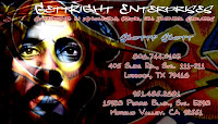
Before I get these proofs sent off, he sends me an email with a scanned drawing his friend made for him attached, and suggested that maybe I use it too. You know- if there was any room left over for it. But don't change the drawing. We wouldn't want to hurt his friend's feelings. So make it look good on the computer and all, but don't change it.

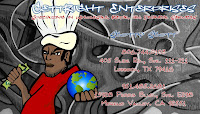
So I send these four proofs. He hates them. And rightfully so. I hate them too. He says he wants to just come over and sit at my desk with me and we can design it together step by step.
I and I think "Oh, thank you Jesus. He realizes there's too much shit going on here and we're going to actually turn this into a usable piece of work." NOT. EVEN. CLOSE.
So Dough Boy comes over, looking EXACTLY like you'd think he looked, and he sits down with me. And after two hours of uniting our creative forces- he was ECSTATIC. He loved the new design so much that he even gave me a hug. Said he might want to use it as the cover of his rap CD. But you know-- with a smaller Jesus.
And now, ladies and gentlemen-- I present to you the fruits of our combined labor, the apple of his eye, all his desires put forth into a 3 x 2.5 inch block: THE WORST BUSINESS CARD OF ALL TIME.

Yep. There it is. Big as day. Times New Roman. Arial. Horizontally condensed Mufferaw, even, because he was feeling racy. And no matter how I protested the Pillsbury Dough Boy, his fucked up hands (the real PDB doesn't have fingers), and his even more fucked up hand placement, he would hear none of it. This was PERFECT. Exactly what he had in mind. It would have been nice if I would have gotten the angels and banners on there too, but this was fine without it. We could use the banners later for tee shirts or som'm som'm.
So if the actual design is the measurement of my ability as a designer, I should kill myself post haste. However, if the joy of my client was the measurement, I stacked up HUGE, Nigga. Like a stack of Benjamins, yo.
Peace out.
I got a call from a guy named Scotty Scott one day. He said he needed a business card. Fine. I asked him to tell me the info he wanted on it, and that I would email him a proof. He proceeded to tell me, in a voice deeper than Barry White's, that the card was for two separate businesses (Wholesale/Retail and Financial Services) but he also wanted to be able to hand it out to promote his new career interest as a rapper. The card needed to have bling and show that he had some gangsta cash all up in his shit, but since he's appealing to an older crowd too, it needed to have a religious feel. In fact- why not just add Jesus. Even better- BLACK Jesus. Yeah- Black Jesus on one side and money falling from the sky on the other. And then at the top, put angels carrying a banner with his name on it and the types of businesses. But most importantly, it needs to have the logo. What is the logo? Well, It needs to be the Pillsbury Dough Boy (his rap name was Dough Boy) holding a globe- but make sure you can see his hands. You gotta be able to see his hands. And, of course, all the contact info for both businesses.
I wondered if maybe he was thinking more of a flyer or poster, even. That's kind of a lot for a business card.
Nope. Business card. And now that I think about it- do kind of a graffiti background 'cause it'll look street.
WOW.
So I tried to put this information into something digestable, even though it looked like shit- but at least a compact piece of shit.

I also thought I'd do my own thing and design something that was still street but looked cooler without QUITE so much insanity going on.

Before I get these proofs sent off, he sends me an email with a scanned drawing his friend made for him attached, and suggested that maybe I use it too. You know- if there was any room left over for it. But don't change the drawing. We wouldn't want to hurt his friend's feelings. So make it look good on the computer and all, but don't change it.


So I send these four proofs. He hates them. And rightfully so. I hate them too. He says he wants to just come over and sit at my desk with me and we can design it together step by step.
I and I think "Oh, thank you Jesus. He realizes there's too much shit going on here and we're going to actually turn this into a usable piece of work." NOT. EVEN. CLOSE.
So Dough Boy comes over, looking EXACTLY like you'd think he looked, and he sits down with me. And after two hours of uniting our creative forces- he was ECSTATIC. He loved the new design so much that he even gave me a hug. Said he might want to use it as the cover of his rap CD. But you know-- with a smaller Jesus.
And now, ladies and gentlemen-- I present to you the fruits of our combined labor, the apple of his eye, all his desires put forth into a 3 x 2.5 inch block: THE WORST BUSINESS CARD OF ALL TIME.

Yep. There it is. Big as day. Times New Roman. Arial. Horizontally condensed Mufferaw, even, because he was feeling racy. And no matter how I protested the Pillsbury Dough Boy, his fucked up hands (the real PDB doesn't have fingers), and his even more fucked up hand placement, he would hear none of it. This was PERFECT. Exactly what he had in mind. It would have been nice if I would have gotten the angels and banners on there too, but this was fine without it. We could use the banners later for tee shirts or som'm som'm.
So if the actual design is the measurement of my ability as a designer, I should kill myself post haste. However, if the joy of my client was the measurement, I stacked up HUGE, Nigga. Like a stack of Benjamins, yo.
Peace out.
Wednesday, February 17, 2010
Wednesday, January 20, 2010
Because I'm a Dork
More Daybreakers concept propaganda,
based on this WWII poster for the Dept. of Agriculture.
CAPTURE HUMANS, GO GO GO!
based on this WWII poster for the Dept. of Agriculture.
CAPTURE HUMANS, GO GO GO!
Tuesday, January 19, 2010
Wednesday, January 13, 2010
Wednesday, January 6, 2010
Book Club Invite
Monday, November 30, 2009
Wednesday, November 18, 2009
Subscribe to:
Comments (Atom)


